TYPE
Data Visualization/Infographics
University Project
University Project
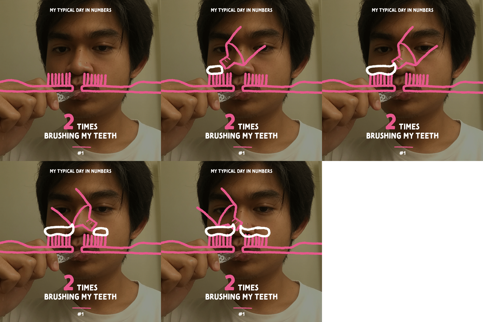
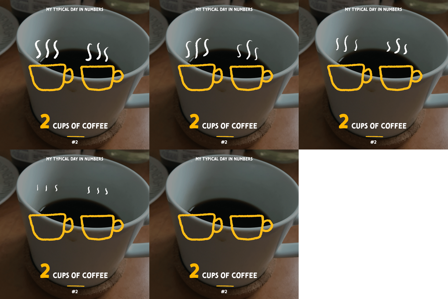
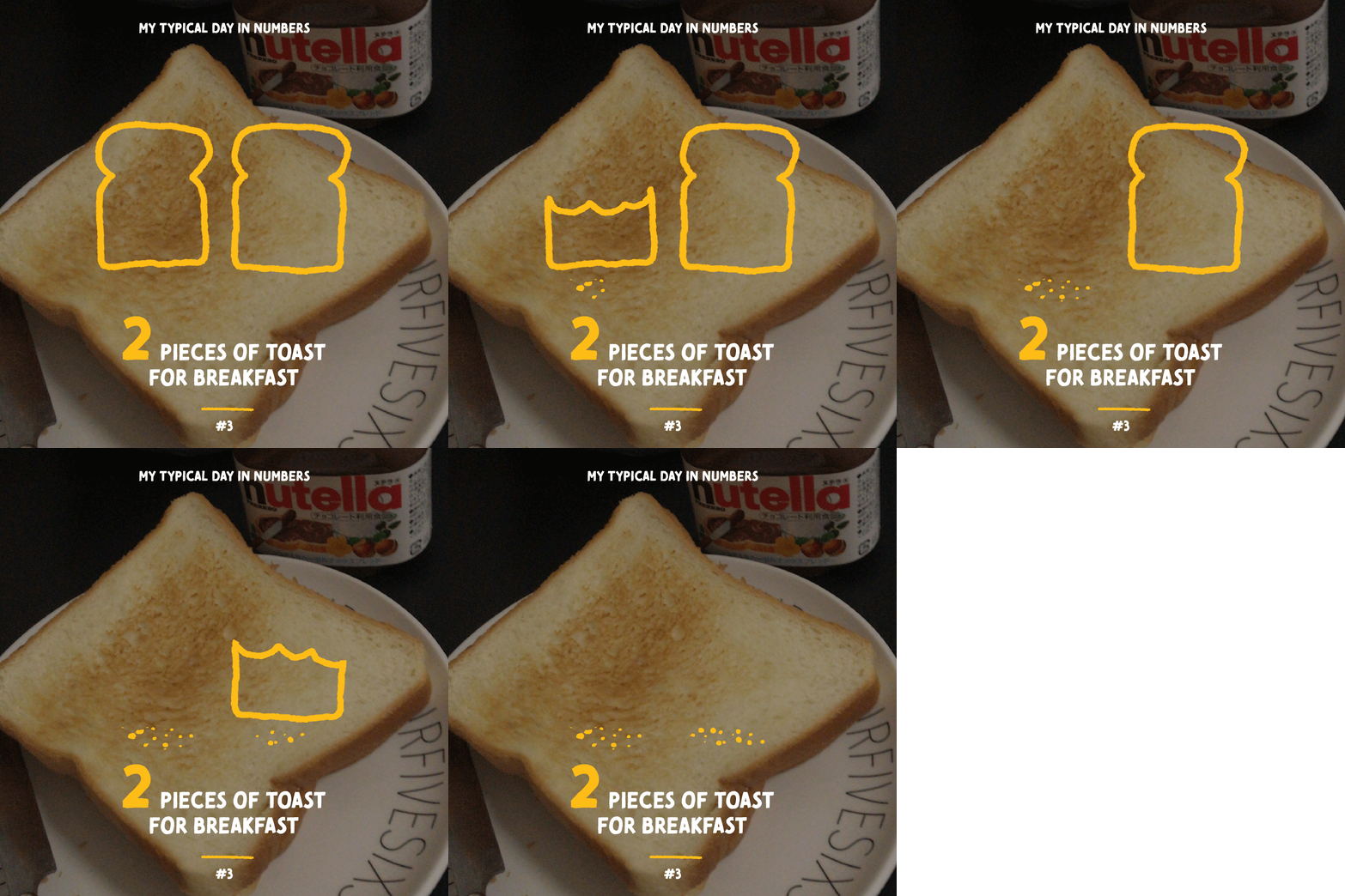
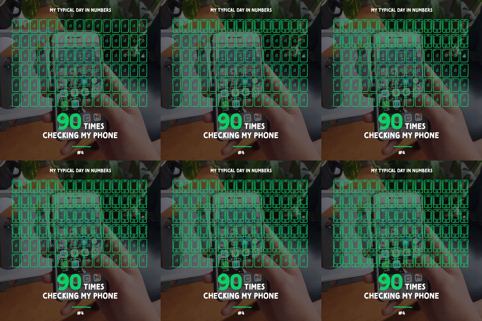
We all have some kind of routine in our day-to-day life. While that might not be something that is very interesting to share with others, I took the challenge to share mine with the people around me in a rather exciting way.
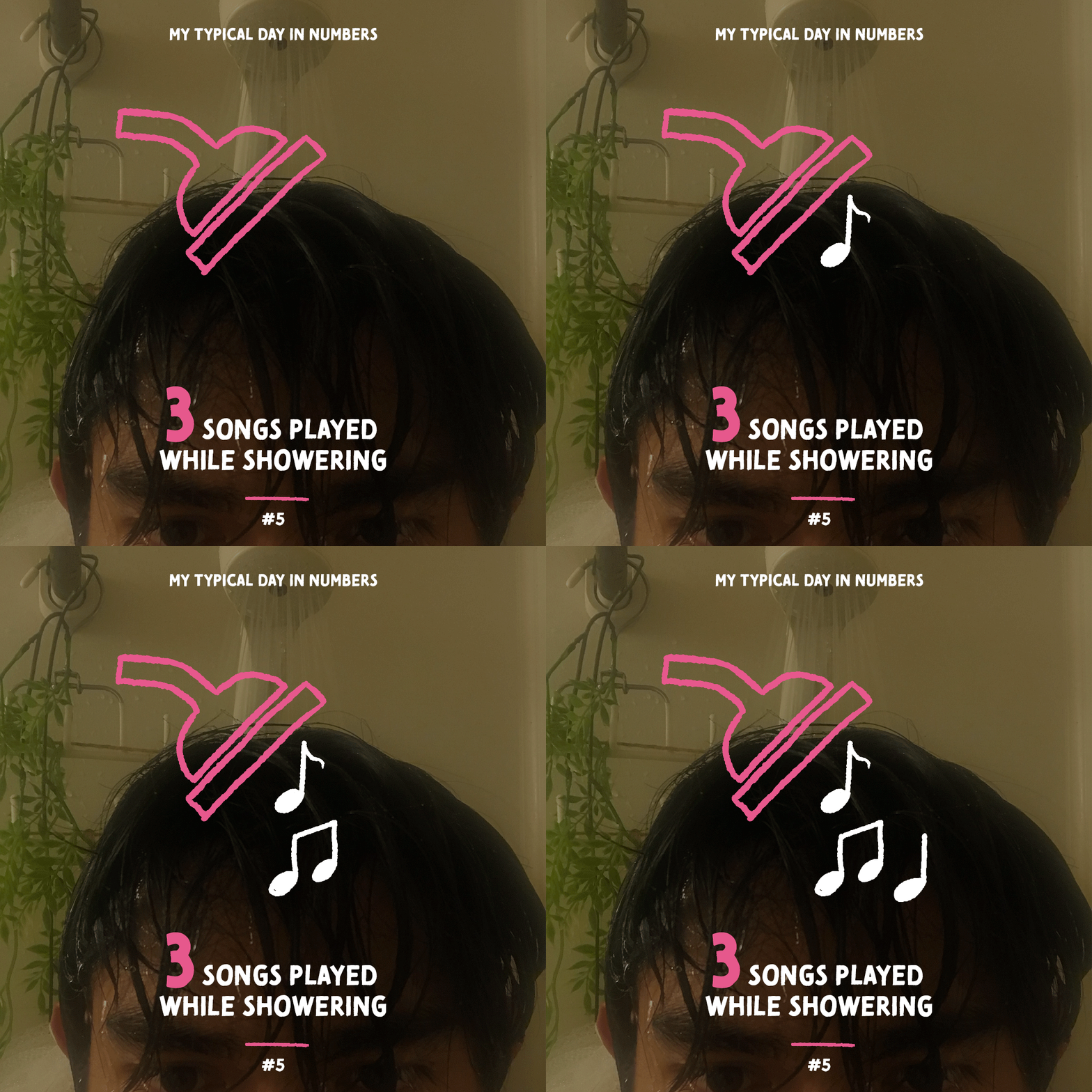
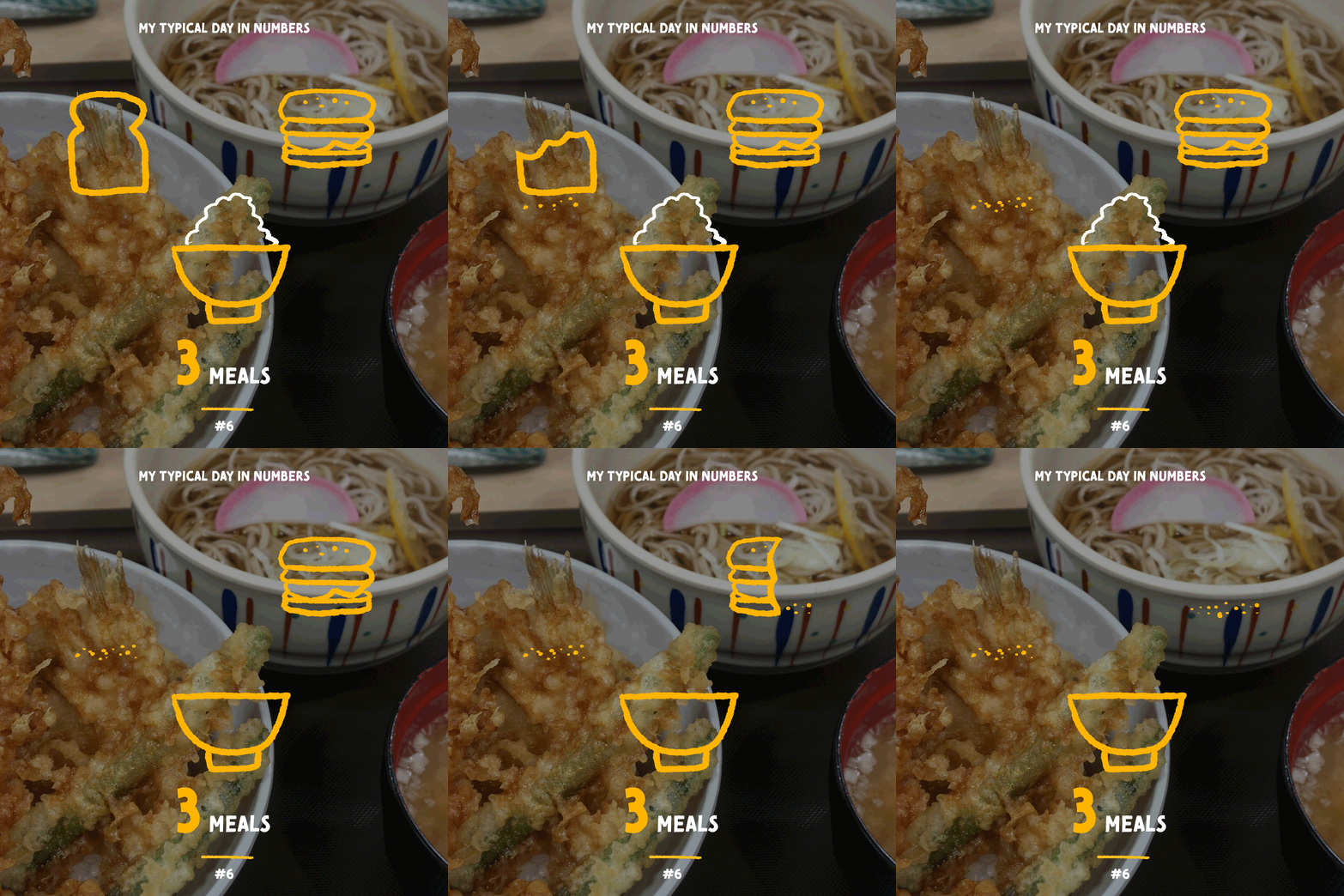
Inspired by Giorgia Lupi's "happy data", I opted for this style because I feel like since this is a really personal thing to me, I need to convey that same feeling through the posters to the audience. To realize that, I chose a handwritten typeface called "Tomarik Brush" combined with rough hand-drawn illustrations and simple GIF animation.
The addition of a snapshot of the topic in the background also added a bit more context and personality to it. The use of bright color also gives it a cheerful atmosphere while also being a way to direct the viewer's focus to the numbers and the illustrations first.
Since the target audiences are my family and friends, and this also heavily relies on the graphics and animation to make it attractive, I decided to upload it onto my personal Instagram account, hence the 1:1 aspect ratio.
